





Gives the window a clear outline
Ideal when window frames or handles are allowed to be part of the interior.
Anthracite and dark grey give the window depth. The colours are strong, but softer than full black, which makes them easy to use in living rooms, offices and modern glazed façades.
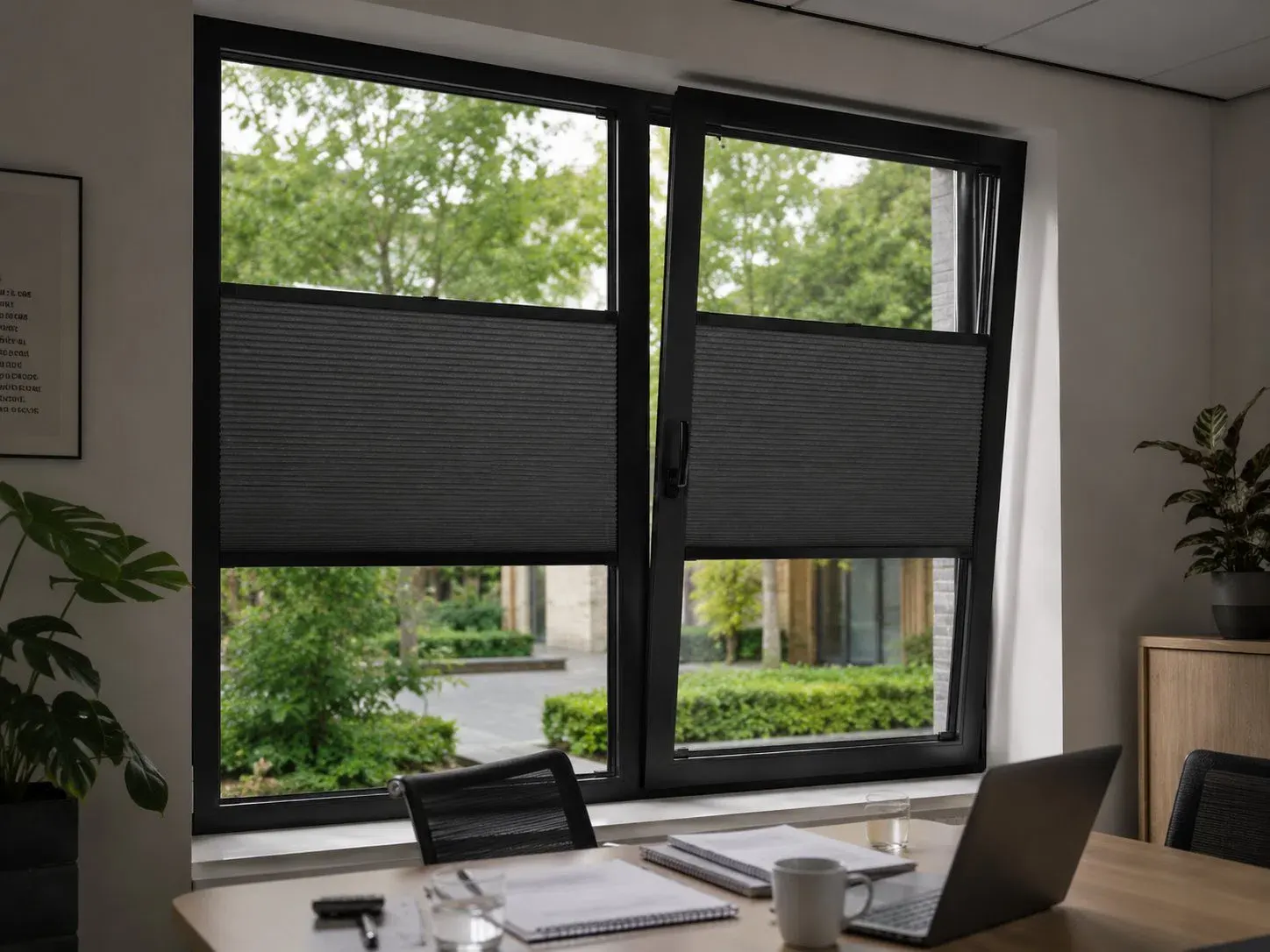
Anthracite and dark grey add depth without the stark contrast of black, so they fit into many modern interiors.
Ideal when window frames or handles are allowed to be part of the interior.
Dark grey is strong, but looks less harsh than deep black.
On a large, bright window you get a nice balance between contrast and view.
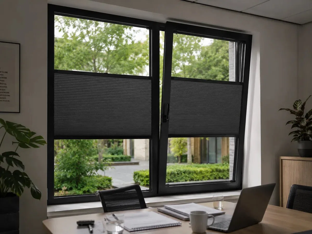
Let the dark shade come back in window frames, kitchen fronts or metal details. With lighter walls and wood, the whole stays balanced and not too heavy.
Light walls and flooring keep the room open.
Window frames, pleated blind and a few pieces of furniture form one graphic line.
Wood, cognac or brass makes the whole look inviting.
Light-filtering, coloured or blackout: first choose the look, then how much light you want to control.
White outside, dark grey inside. That's how you combine a dark interior style with a calm façade.
Dark on both sides, so it looks good with anthracite aluminium, dark stone or woodwork.
A dark Black-out fabric gives maximum calm in a bedroom, home cinema or presentation room.
RAL 7016 usually matches anthracite window frames best. With black window frames, RAL 9005 is a good fit. On white window frames you can also deliberately choose RAL 9003, so that only the fabric provides contrast.
The obvious choice with anthracite and dark grey.
For black window frames and a stronger line.
When the profile should disappear against a white window frame.
RAL 7016 is the most logical profile colour with anthracite; RAL 9005 sharpens the contrast. With a light window frame, the adhesive profile can stay light and only the rail can be dark.
Dark grey pleated blinds work well in more rugged or modern rooms and instantly add contrast and depth.
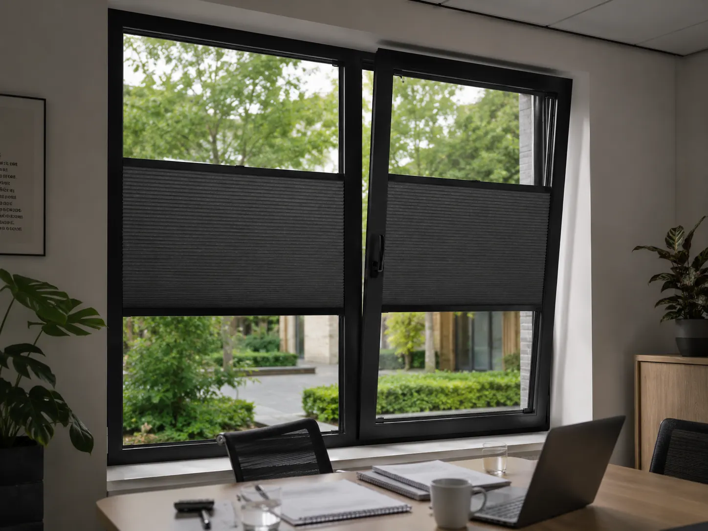
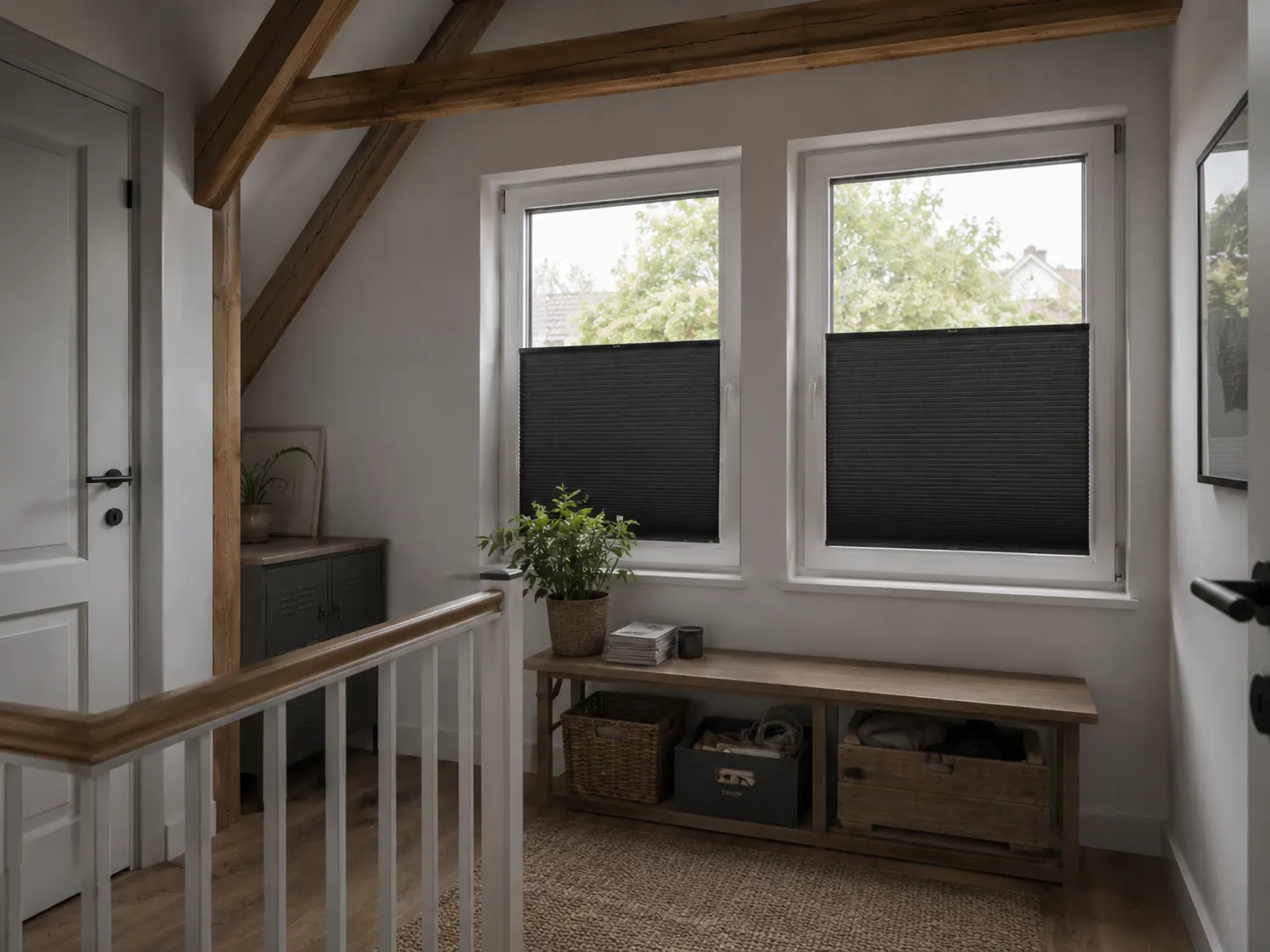
Use the colour as a calm base, a warm connecting element or as a clear accent.
Dark window, light wood and calm walls.
Combine with matt black, concrete and oak.
Graphite with soft fabrics and warm lighting.
Let the window frame, profile and operating rail form one sleek frame.
Dark grey can come across as cool or warm. Hold the sample next to the window frame and the largest furniture surfaces to see which undertone really fits.
Repeat the colour two or three times; then it feels intentional rather than random.
Top-down/bottom-up stops a dark fabric from filling the entire window all day.
Dark grey can have green, blue or brown undertones.
Dust can show sooner on dark fabrics; regular gentle dusting helps.
Hold the samples against the window frame and look at them during the day, in the evening and from outside.
A dark surface can feel heavy when the whole window is covered. With top-down/bottom-up and light walls, it still feels spacious.
RAL 7016. With black window frames, RAL 9005 often looks better.
No. Anthracite is dark grey and usually looks softer.
Yes, choose Duo Tone.
Yes. It reduces visual clutter and can pleasantly filter bright light.
Often, yes. A soft brush or duster keeps the pleated blind looking neat.
Compare anthracite, graphite and black at home. A subtle undertone determines whether the fabric blends in calmly or creates contrast.
No damage to your window frame
A perfect fit for every window
Improved insulation and blackout
Privacy, blackout and insulation
In the Netherlands, Belgium, Germany and France