





Calm with more depth
Taupe stays neutral, but defines the window slightly more clearly than white or cream.
Taupe and warm grey sit right between beige and grey. That makes them feel calm and luxurious, and they combine just as easily with wood as with black, steel and natural stone.
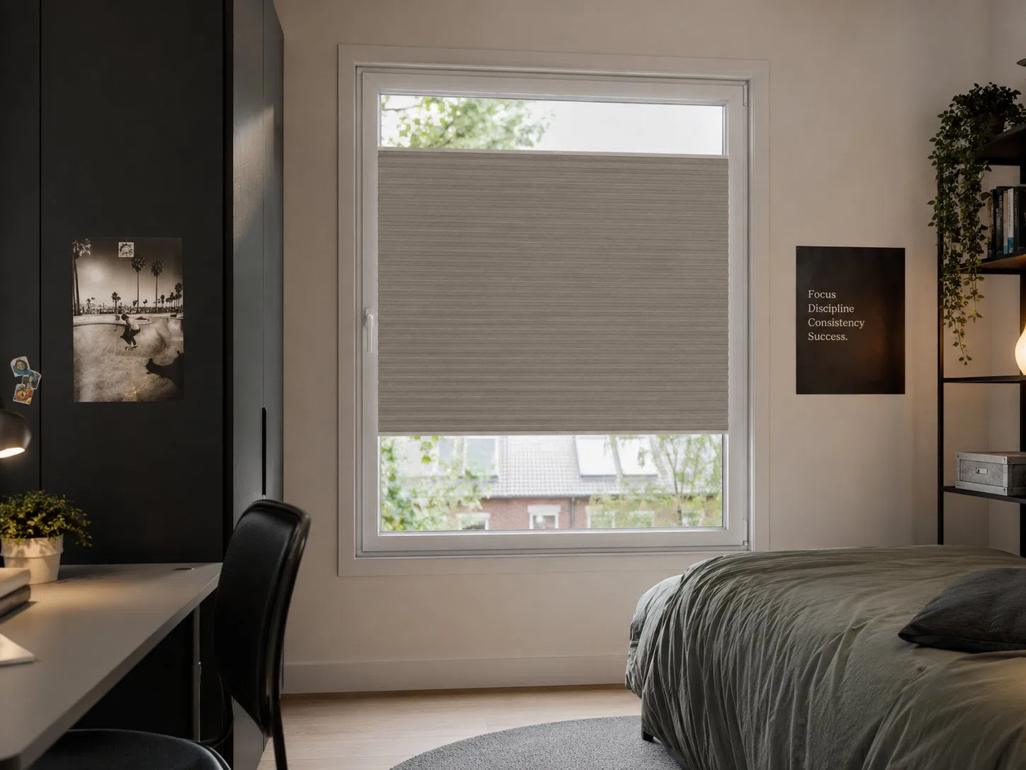
Taupe and warm grey connect cool grey tones with the warmth of wood, beige and soft earth tones.
Taupe stays neutral, but defines the window slightly more clearly than white or cream.
The colour suits a warm wooden floor as well as cool grey or black elements.
Tone-on-tone taupe feels refined without becoming showy.
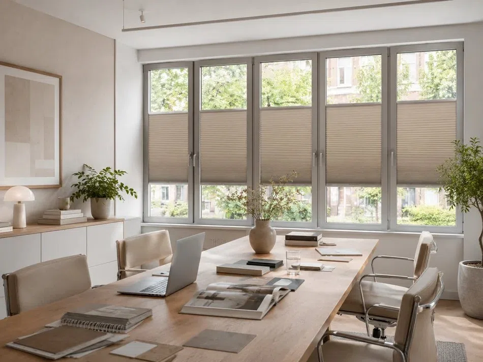
Look not only at the wall, but also at the floor, type of wood and upholstery. A taupe with the right undertone brings those materials together without being too prominent.
Walls, floor and large furniture in calm mid-tones.
Wood, bronze, wool or cognac-coloured leather.
Black, deep green or dark blue for contrast.
Light-filtering, coloured or blackout: first choose the look, then how much light you want to control.
The safe choice when you want taupe inside but a white, uniform look from outside.
A deep taupe shade is also visible from outside and goes beautifully with dark stone or woodwork.
Warm grey Black-out fabrics bring a lot of calm to a bedroom or workspace.
RAL 7035 often goes well with a greyer taupe. RAL 9001 matches a warmer, beige taupe. Dark window frames usually call for RAL 7016 or 9005 as the adhesive profile.
With greige, concrete-look and light aluminium window frames.
With warm taupe, cream walls and wood.
With an anthracite window frame, dark kitchen or black details.
RAL 9001 or 7035 often sits calmly with a warm light base; RAL 7016 can give a stronger outline. The operating rail can support the fabric colour.
Taupe sits nicely between beige and grey. That makes this colour calm, grown-up and very easy to use in different interior styles.
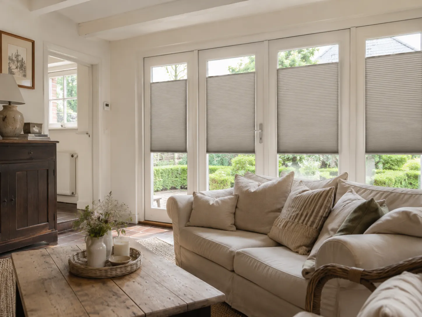
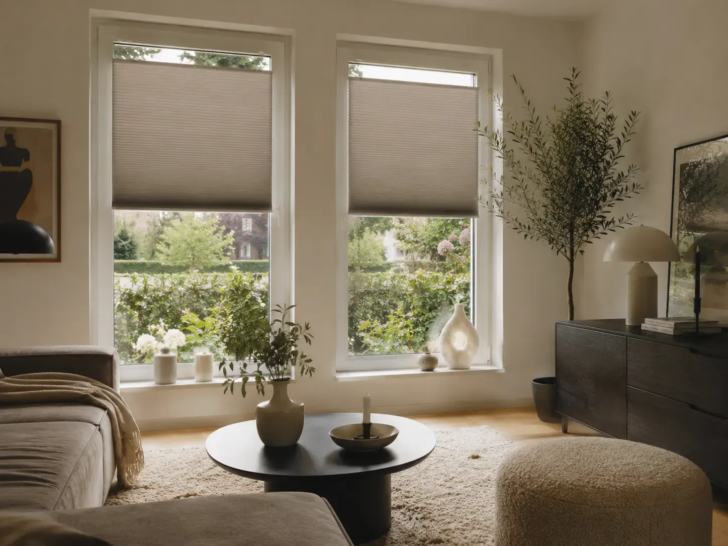
Use the colour as a calm base, a warm connecting element or as a clear accent.
Taupe, soft lighting and a rich headboard.
Warm grey with wood and a few black lines.
Combine taupe with decorative mouldings, bronze and dark wood.
Greige, concrete, walnut and graphic art.
Taupe changes a lot in north or south light. So compare the free sample directly at the window and judge it in both cloudy and sunny light.
Next to cool grey, taupe can suddenly look brown, or next to beige it can look grey.
The colour visibly shifts with light and shadow.
The adhesive profile can match the window frame and the operating rail the fabric.
Regular dusting keeps the fine pleats looking good.
Hold the samples against the window frame and look at them during the day, in the evening and from outside.
Taupe contains both. One fabric is greyer, another warmer and browner.
RAL 7035 with cool taupe, RAL 9001 with warm taupe and RAL 7016 with anthracite window frames.
Yes. Choose a lighter taupe and let in plenty of daylight with top-down/bottom-up.
Very well. The soft fabric takes the hardness out of the black frame.
Yes. That gives you a calm, cosy bedroom.
Add a clear dark or coloured accent, for example black, olive or dark blue.
Request several warm grey tones. The right sample is the colour that stays calm with both the floor and the window frame.
No damage to your window frame
A perfect fit for every window
Improved insulation and blackout
Privacy, blackout and insulation
In the Netherlands, Belgium, Germany and France