





Softer than bright white
Cream removes harsh contrast and instantly makes a room friendlier.
Cream and off-white offer the same calm as white, but feel softer and warmer. Ideal when bright white looks too cool against the floor, wall or window frame.
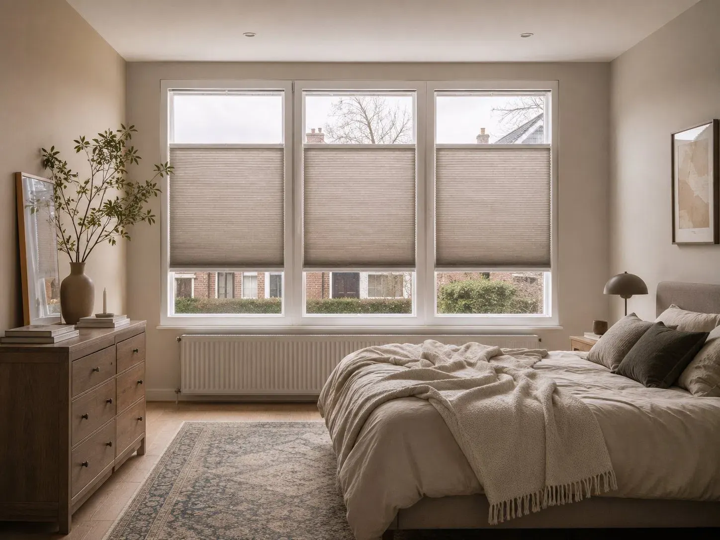
Cream and off-white soften a room and often blend better with warm walls, wood and more classic interiors than bright white.
Cream removes harsh contrast and instantly makes a room friendlier.
The colour forms a natural bridge between wood, wool, leather and lime tones.
Even across several windows the look stays light and refined.

Pay attention to the yellow, beige or grey undertone. The right shade looks warm without becoming old-fashioned and avoids a harsh contrast with the window frame.
Cream walls, a sand-coloured floor or a soft sofa.
Oak, rattan, bouclé and linen prevent a flat look.
Dark brown, olive green or anthracite as a small accent.
Light-filtering, coloured or blackout: first choose the atmosphere, then how much light you want to control.
Choose within cream while the outside stays white. Handy when different rooms get different colours.
The warm colour is visible inside and out and can match woodwork or light facing bricks beautifully.
A warm, light Black-out fabric makes a bedroom feel cosy without making the window look visually heavy.
RAL 9001 often matches cream window frames and warm fabrics best. On bright white uPVC window frames RAL 9003 can be calmer, while an operating rail in RAL 9001 follows the fabric.
The natural choice with cream, ivory and warm white.
For bright white window frames with a warm fabric.
A refined dark accent with bronze, black steel or dark wood.
RAL 9001 is the natural choice with cream window frames or a warm fabric. With bright white window frames, RAL 9003 lets the profile disappear and gives the fabric the warm accent.
These shades are softer than bright white and therefore go beautifully with wood, sand-coloured floors and warm interiors.
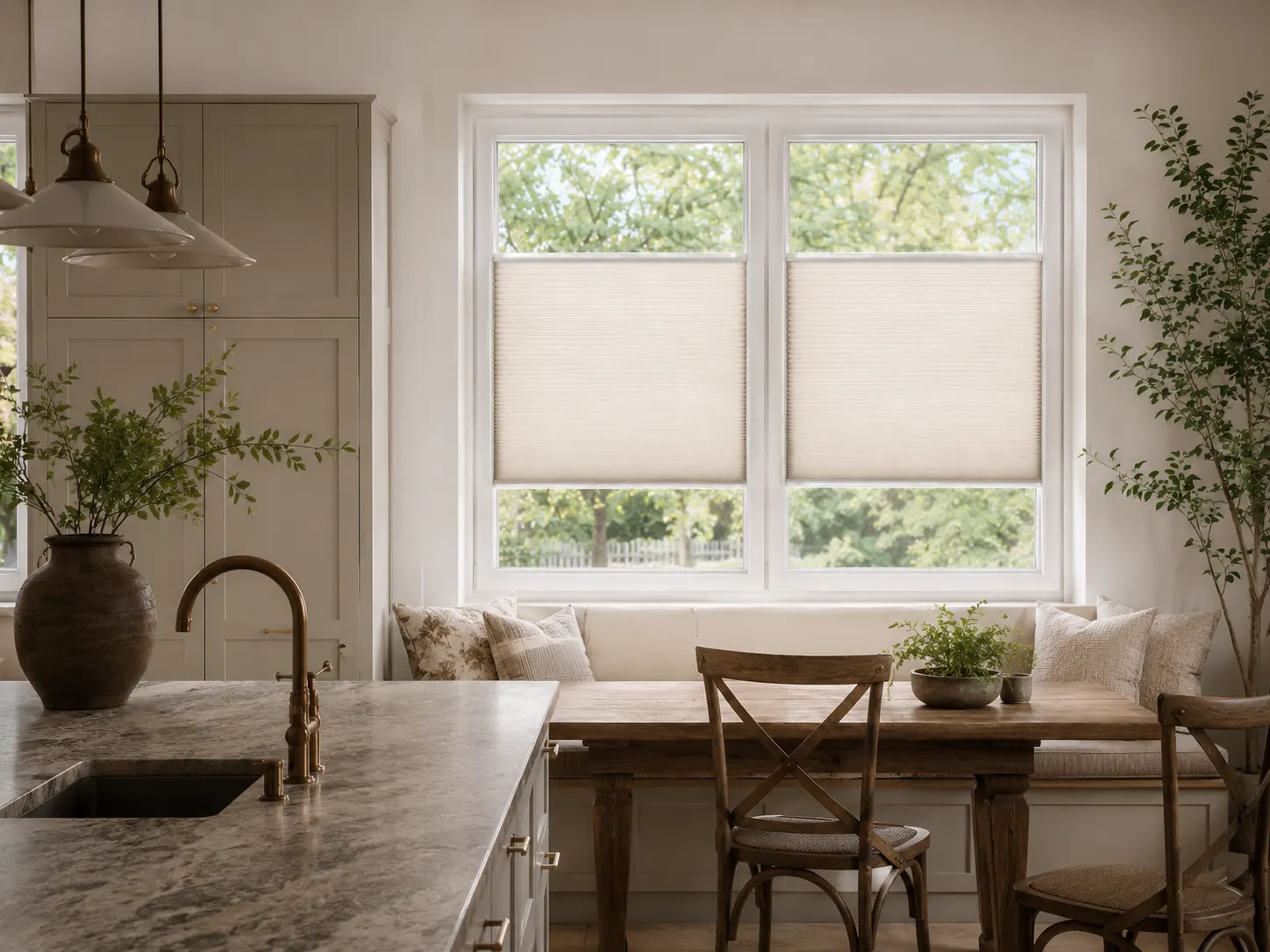
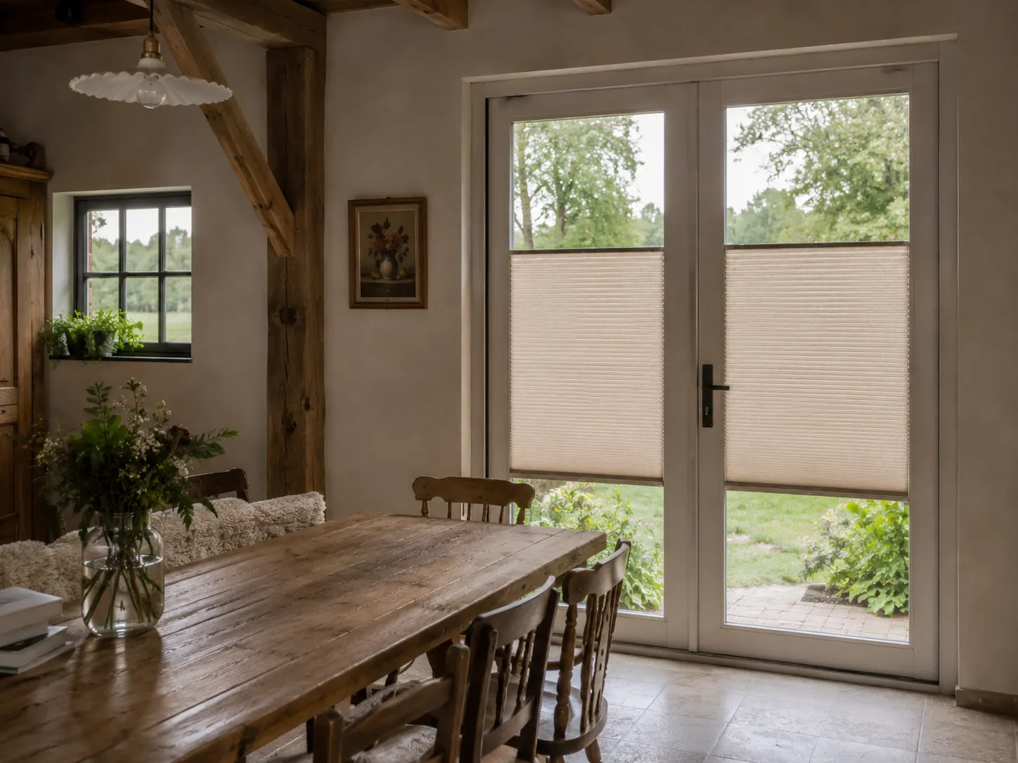
Use the colour as a calm base, a warm connecting element or a bright accent.
Cream with decorative mouldings, wool and dark wood feels rich but not old-fashioned.
Work tone on tone with just a few materials and plenty of calm surfaces.
Combine with reclaimed wood, ceramics and natural fabrics.
Cream takes the chill out of white walls and sleek window frames.
Compare the sample in daylight and artificial light. Warm lamps can make cream look noticeably fuller, while cool daylight makes the shade appear more neutral.
A cream fabric can look more yellow next to a cool white wall.
Warm lamps deepen cream; cool light makes the shade more neutral.
Adhesive profile and operating rail do not have to be the same colour.
Stick & Fit is delivered free of charge in the Netherlands, Belgium, Germany and France.
Hold the samples against the window frame and look at them during the day, in the evening and from outside.
Off-white is closer to white; cream usually has a clearly warmer, beige or yellow undertone.
RAL 9001 often suits. With a bright white window frame, RAL 9003 can blend in better.
A light cream fabric generally keeps the room soft and bright. The choice of fabric determines how much daylight is filtered.
Yes, especially with warm grey or greige floors. Request a sample to compare the undertone.
Certainly. The soft fabric and the dark window frame create a calm, modern contrast.
There are light Black-out fabrics. When measured correctly, the blackout can be around 99%.
Request cream, ivory and off-white as samples and see which undertone really suits the room.
No damage to your window frame
A perfect fit for every window
Improved insulation and blackout
Privacy, blackout and insulation
In the Netherlands, Belgium, Germany and France