





Warm without becoming overwhelming
Beige adds atmosphere, but stays calm enough as a base for the whole room.
Beige, sand and natural make an interior warm without using bold colour. They go easily with wood, stone and the calm shades found in many interiors.
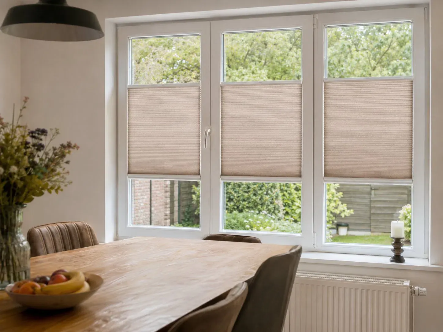
Beige, sand and natural bring warmth without much colour intensity and go well with wood, linen, stone and soft whites.
Beige adds atmosphere, but stays calm enough as a base for the whole room.
Combine different sand shades for a rich result without harsh contrasts.
The warm fabric softly frames the garden and the view.
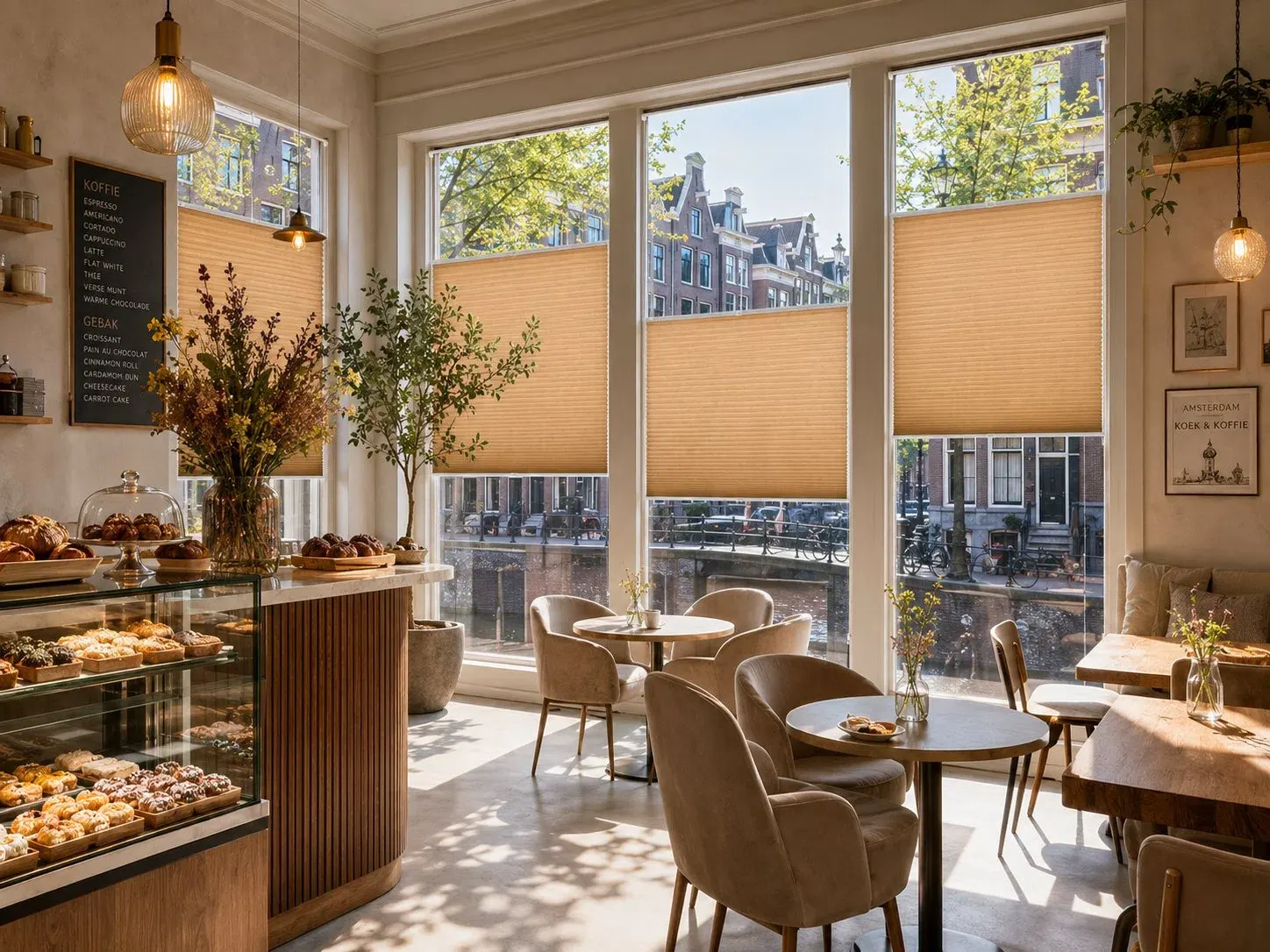
Choose a shade that matches the largest fixed materials, such as the floor and kitchen fronts. The fine texture of the fabric then adds enough depth.
Large surfaces stay light and soft.
Oak, rattan, jute and linen bring natural texture.
Terracotta, rust or olive brings the combination to life.
Light-filtering, coloured or blackout: first choose the look, then how much light you want to control.
A warm sand shade inside, white outside. Especially useful when the façade needs to stay calm and uniform.
A deeper natural colour is also visible from outside and can go nicely with brickwork or timber cladding.
Sand-coloured Black-out fabrics give a bedroom warmth and help keep out light, cold and heat.
RAL 9001 and 7035 are calm choices with beige. With black or anthracite window frames, you can instead follow the colour of the window frame and choose a warm operating rail to match the fabric.
Warm and calm with cream, sand and natural.
Neutral with greige walls, concrete-look finishes and light grey window frames.
A clear contrast with black details or steel doors.
RAL 9001 or 7035 often creates a soft transition; RAL 9003 keeps the profile fresh with white window frames. The operating rail can be closer to the fabric colour.
These are true mood colours. They connect window frame, furniture and floor and instantly feel warm and calm.
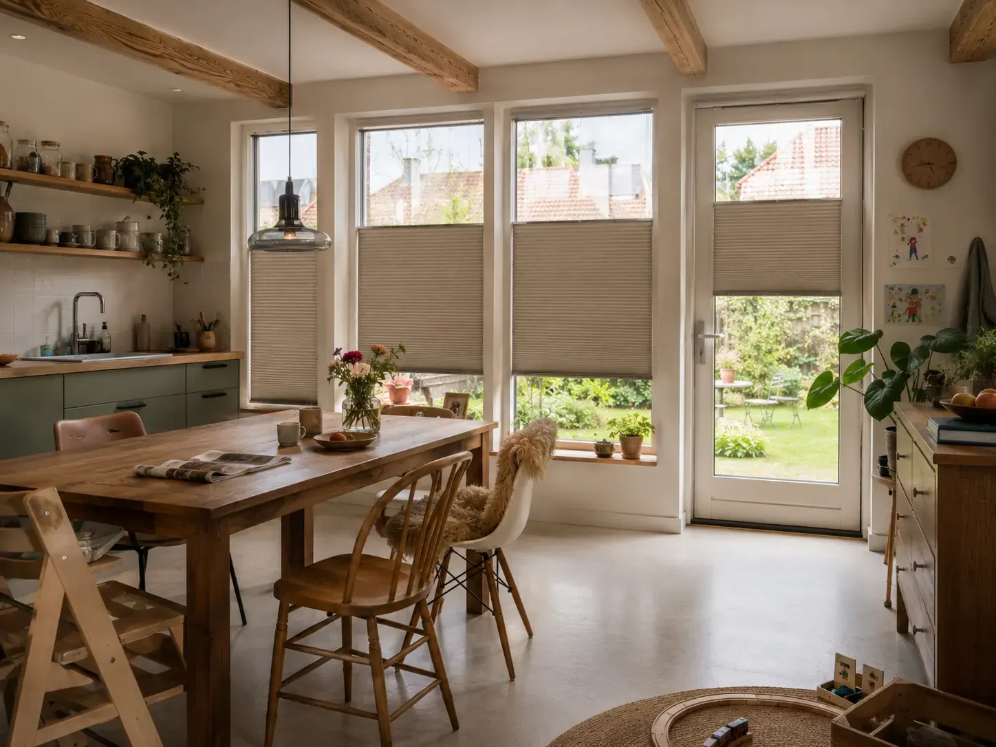
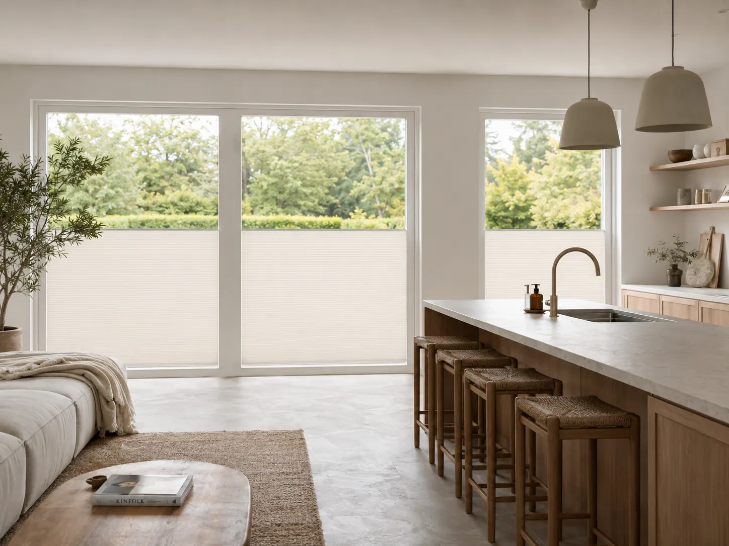
Use the colour as a calm base, a warm connecting element or as a clear accent.
Sand, light wood and a few dark lines.
Combine natural tones with lime white, terracotta and ceramics.
Old beams and fresh white are connected by a warm neutral fabric.
Let small colour variations and natural materials show.
Natural shades react strongly to sunlight. Look at the sample on the window and next to wood or flooring to avoid the colour coming across as too pink, yellow or grey.
A sand colour doesn't have to match exactly, but it should have the same warm or cool undertone.
With neutral colours, subtle differences make a big difference.
A soft brush, a duster and, for a stain, a slightly damp cloth.
Standard up to 1800 mm wide; non-standard sizes and other operating systems are possible on request.
Hold the samples against the window frame and look at them during the day, in the evening and from outside.
Beige is a calm base colour that combines easily with wood, colour accents and different interior styles.
Sand is often slightly lighter and more natural; beige can be warmer or greyer. The right choice depends on the floor, walls and daylight.
RAL 9001 is warm, RAL 7035 more neutral. With dark window frames, you can instead match the adhesive profile to the window frame.
Yes. Duo Tone fabrics are always white on the outside.
Yes, there are Black-out fabrics in warm light shades.
Certainly. Combine it with clean shapes, few accessories and a dark accent for a modern look.
Compare beige, sand and taupe at home. Only in real daylight can you see which sample goes best with your floor and window frame.
No damage to your window frame
A perfect fit for every window
Improved insulation and blackout
Privacy, blackout and insulation
In the Netherlands, Belgium, Germany and France